Description
Project Overview
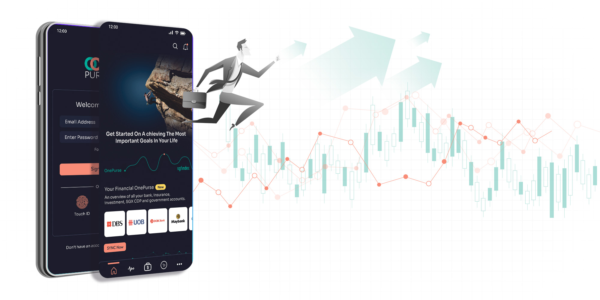
OctoPurse is an intuitive and cross-platform finance planning app. This enables Singaporeans to do better financial planning and achieve financial well-being.
Users and Audience
My Role
- User Research
- Personas
- Scenario
- Task Flow
- IA
- Low Fidelity
- Design System
- High Fidelity
- PET Strategy
- Usability Testing
Project Duration
2
+ Week48
ScreenMobile Apps | 2021
Problem Statement
With multiple apps/platforms available these days for investment and trading, it is increasingly difficult to keep track, or even rebalance one's portfolio with ease across so many apps.
Possible Solutions
Create apps are able to simplify the process of portfolio balancing across multiple apps, create healthier financial habits, and generate financial literacy in working adults. In doing the above, there is also better time savings and the ease of diversifying investment among stocks, and bonds, within different categories and investment types, with simplified tracking and management strategies. Consolidates them to give users a view of assets and liabilities, helping users plan more effortlessly.
Tools Used

Figma

Miro

AI

Uxpressia
Design Thinking Process
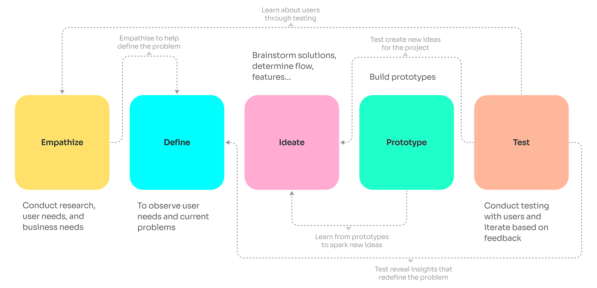
 Empathize
User Research
Qualitative Research (1 to 1 Interview)
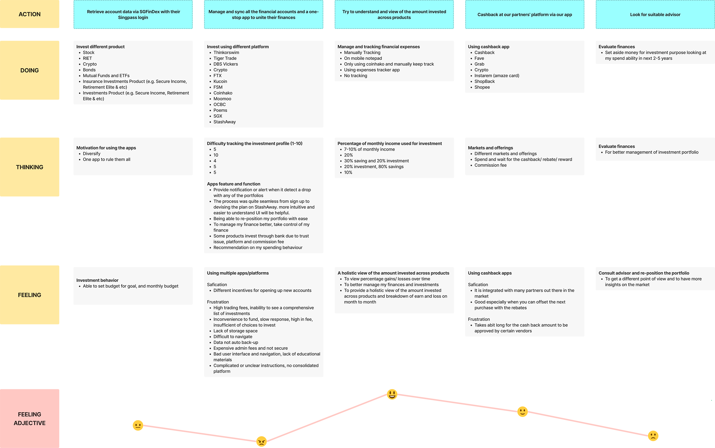
1 to 1 interview has been conducted with a total of 5 participants from different age group, Millennials (25-39 years old), Generation X (40-54 years old), and Baby Boomers (55-65 year old), each of them lasted for about 30 minutes. Some data are gathered which allows me to explore deeper about the user’s mental model.
- Do you know your financial situation and monthly money insight? Can you describe in detail (e.g. how many percent of savings are used for investment)?
- Are you doing any investment? If yes, a. What are you investing in? b. What trading platform/apps are you using? c. What is the reason you are using a different trading platform/app? d. How do you track your investment profile? e. Are you facing any difficulty tracking your investment profile? (linear scale: Easy 1-10 Hard) f. What is the bad experience you encounter when using the trading platform? • If not, what is the reason you are not doing any investment?
- Do you consult any financial advisor to do investments? If yes, a. Why do you consult any financial advisor to do investments? • If not, what is the reason you are not consulting any financial advisor to do an investment?

- Do you think that you will use financial planning apps? If yes, a. Why will you use financial planning apps? b. Can you tell me the most memorable experience using financial planning apps? c. Any additional features you wish to have in the app? d. What could be the reason to stop using the apps? • If not, what is the reason you are not using any financial planning apps?
- Are you using reward/rebate/cashback apps? If yes, a. What are the reward/rebate/cashback apps you are using? b. Can you share with me your user experience? • If not, what is the reason you are not using reward/rebate/cashback apps?

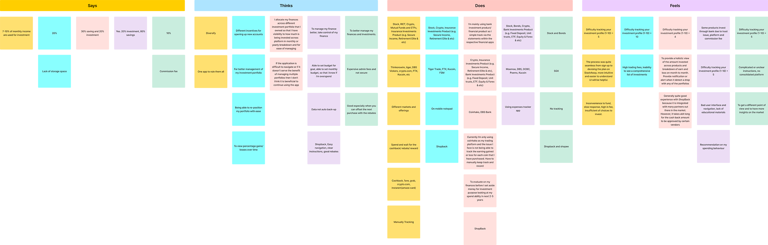
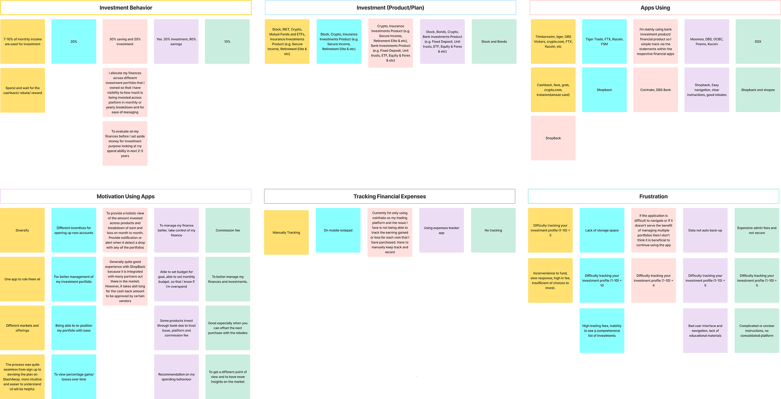
Empathy Map
Affinity Diagram
Customer Journey
 Define
Persona
Using the results of the survey and interview, two personas are matching my business scope to the goal. I created two personas that embody the traits of the target audience. This helps me to understand their primary goal and frustration. The data collected and the resulting personas can be a more direct influence on the designs intended to create.

Nick
About
- Age: 46
- Status: Married
- Gender: Male
- Education: Master Degree
- Occupation: UX Design Lead
- Annual Income: SGD100,000 and Above
Background
Nick has migrated to Singapore with her wife for more than 20 years. He is a tech-savvy guy, an experienced Art Director with a demonstrated history of working in the advertising agencies and media production industry, currently working in the insurance industry as a UX Design Lead. 10% of monthly income is used for investment. He uses multiple trading platforms as the platforms have different markets and offerings (e.g. stocks, REITS, crypto, mutual funds, ETFs, and insurance investment products).
Goal
He hopes that the app can be more diversified. Having just one app can rule them all, manage portfolios, and view percentage gains/losses over time easily.
Frustration
- He encounters problems when using the trading platform - an inconvenience to fund, slow response, high fees, and insufficient choices to invest.
- Current financial tracking is not accurate, always losing track due to using too many trading platforms.
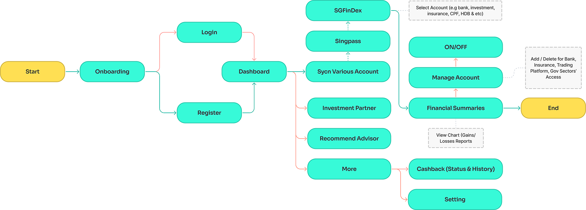
User Flow

Annie
About
- Age: 29
- Status: Single
- Gender: Female
- Education: Bachelor’s Degree
- Occupation: Programmatic trader
- Annual Income: SGD60,001 - 80,000
Background
Annie graduated with a Bachelor of Science - BS, Marketing (SUSS). She allocated 30% of her income for savings and 20% for investment in Crypto, Insurance Investments, and Bank Investment products. She mainly uses bank investment products for investment as the portfolio can simply track via the statements within the apps. She also will consult a financial advisor to evaluate her finances before setting aside money for investment purposes looking at her spending ability in the next 2 - 5 years.
Goal
She hopes the apps can provide a one-stop solution, a holistic view of the amount invested across products, and a breakdown of earns and losses a month to month. Provide notification or alert when it detects a drop with any of the portfolios, being able to reposition the portfolio with ease.
Frustration
- She faces the issue with a crypto trading platform is not being able to track the earnings gained or lost for each coin that she has purchased. Have to manually keep track and record.
- She feels difficult to invest in newcomers without knowledge. It is difficult for investors to build trust in the market, of the high risk of loss.
User Flow
 Ideate
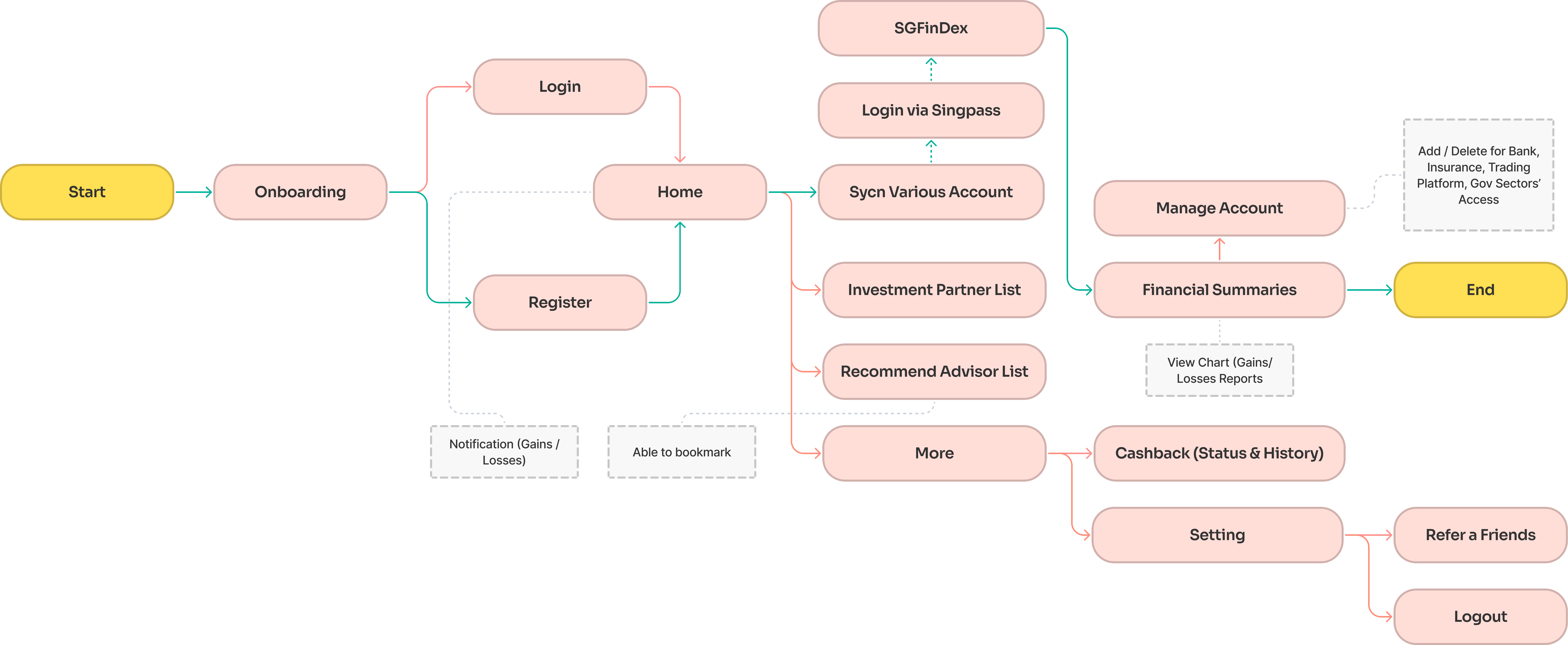
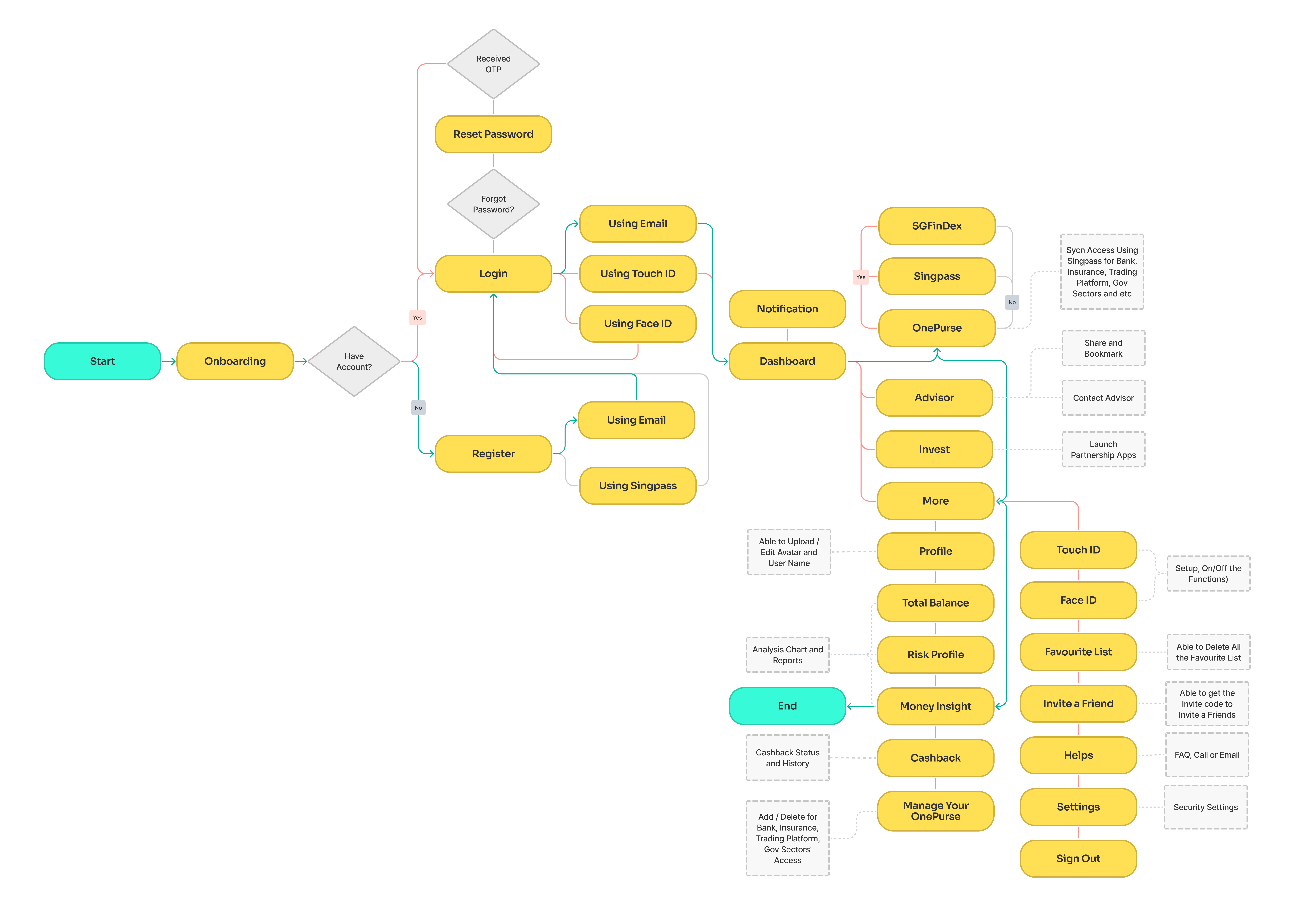
Information Architecture
 Prototype
Low Fidelity Prototype
The first digital visual representation of a designer's idea. To ensure that the developers and clients get a clear understanding of the functionalities and designs. Here is the Low Fidelity Prototype Link.
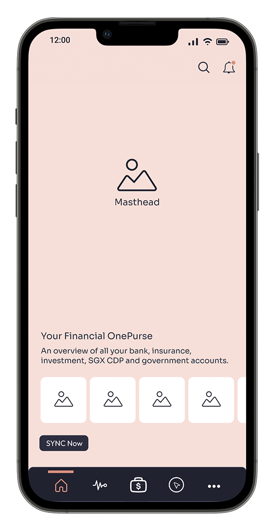
Home
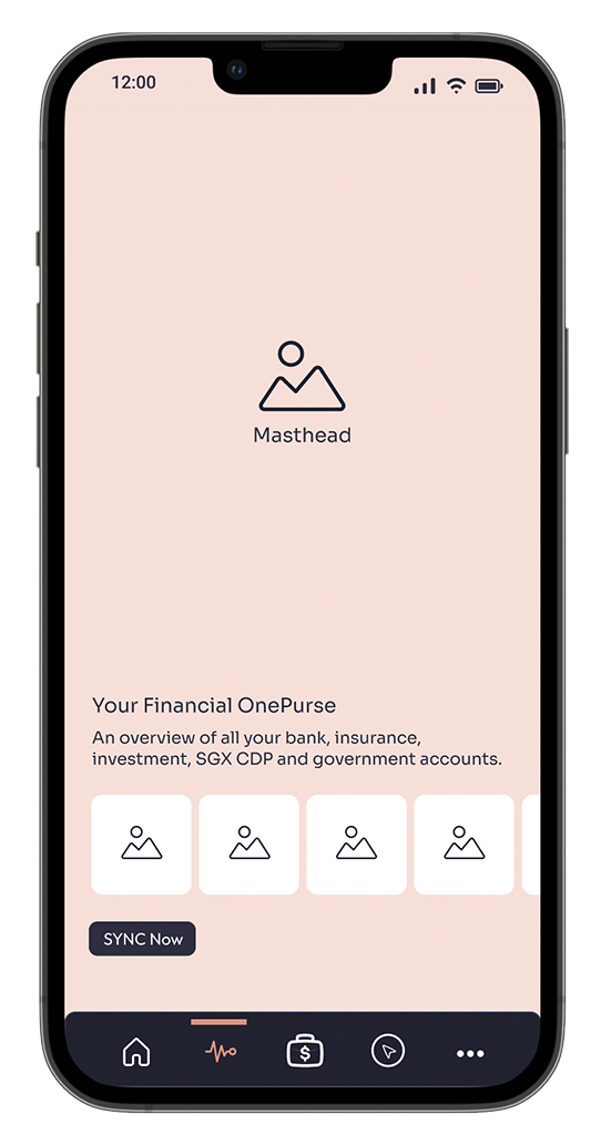
OnePurse
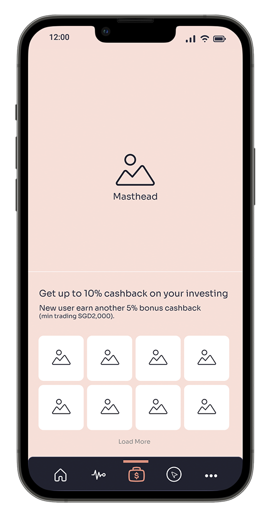
Invest
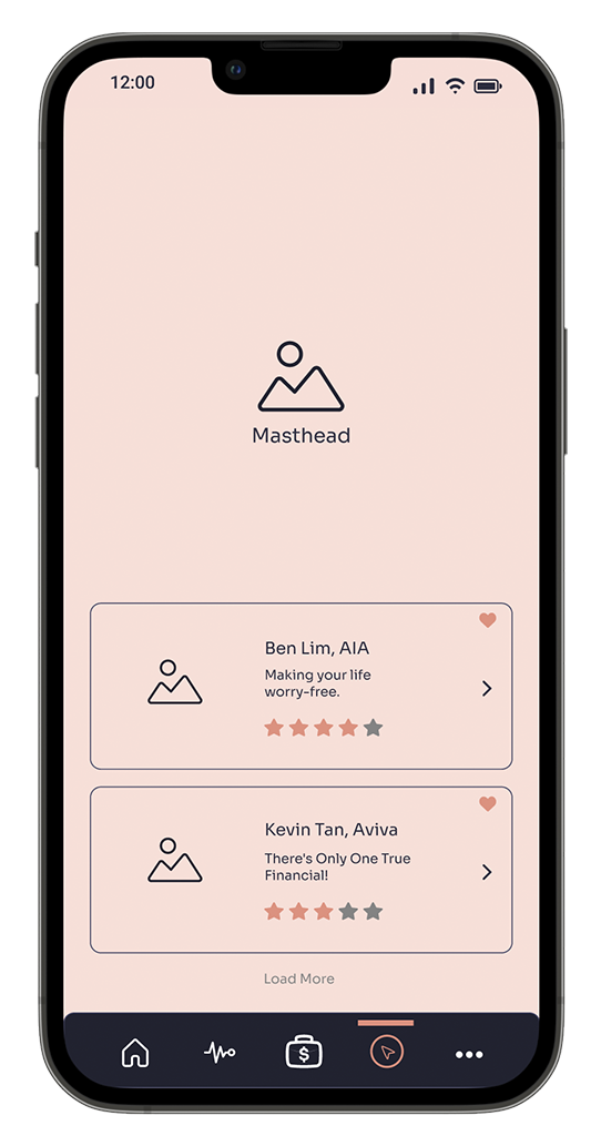
Advisor
Design System
At this stage, I will start the branding design. A design guideline is created for the company.
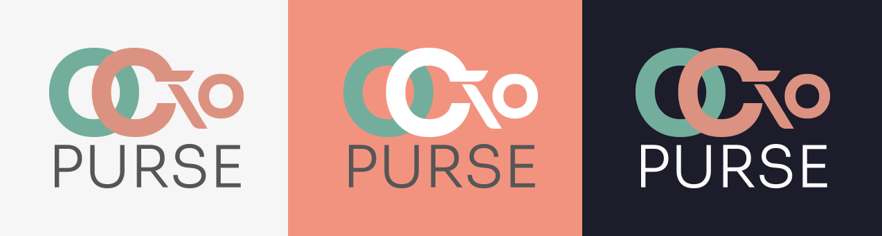
Sora
Aa Bb Cc Dc Ee Ff Gg Hh Ii Jj Kk Ll Mm Nn Oo Pp Qq Rr Ss Tt Uu Vv Ww Xx Yy Zz 1 2 3 4 5 6 7 8 9 0 ‘ ? ’ “ ! ” ( % ) [ # ] { @ } / & \ < - + x ÷ = > ® © € £ $ ¥
#1C1C2C
#F29380
#4BAF9C
#FAFAFA
High Fidelity Prototype
High-fidelity has been produced by referring to the branding guideline. I'm using a predominantly dark theme design to have glamour and striking effect. Hence, I have chosen the colour Black to give my branding a sophisticated and elegant aesthetic feel. Moreover, Black could enhance the power of my application design. To glow it up, a few bright colours have been incorporated to give vitality to the logo design. The essence of Salmon Pink can be seen in my prototype design as I want the user to have an energetic yet comfortable user experience. Here please explore my High Fidelity Prototype Link.
Home
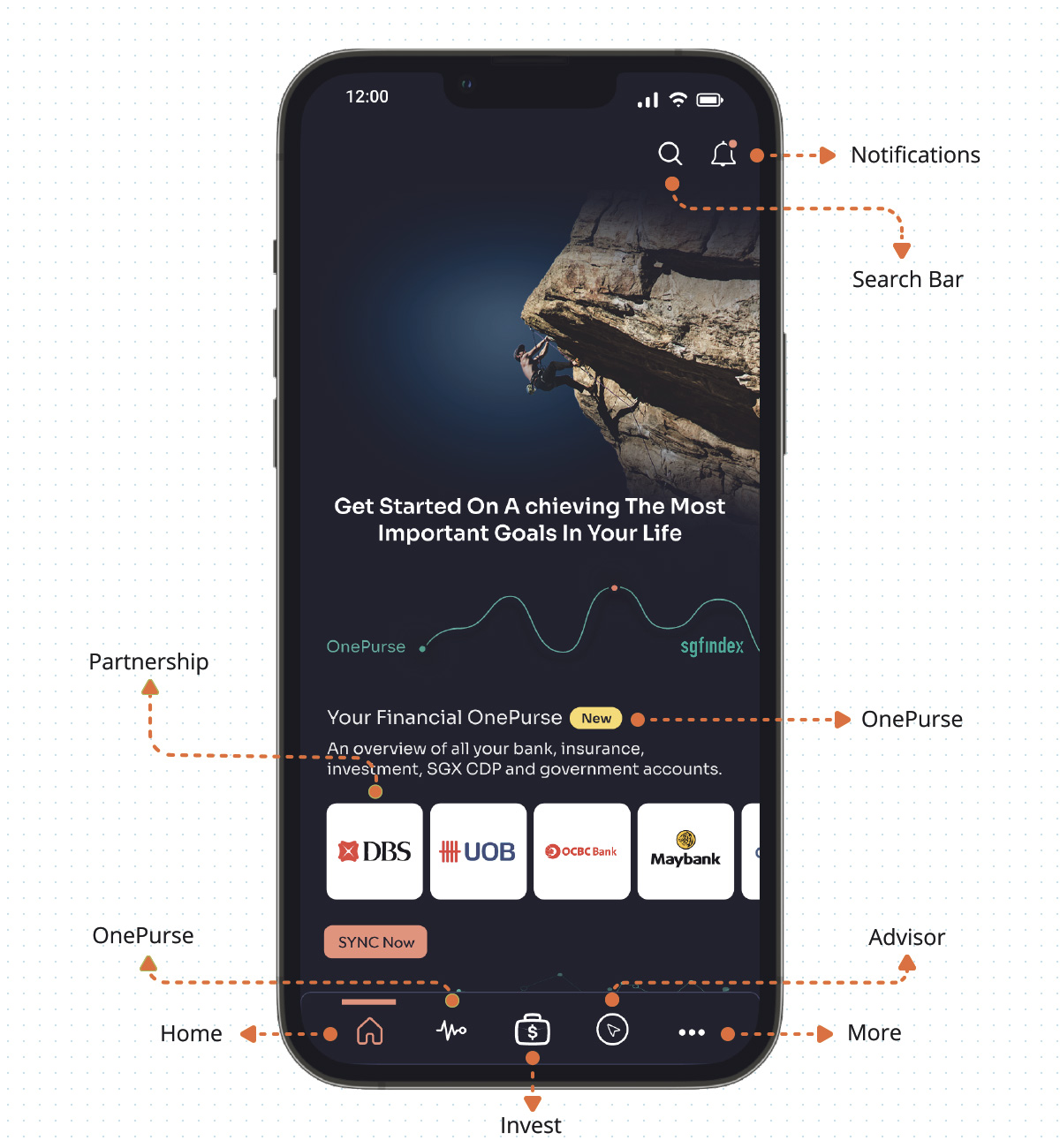
OnePurse
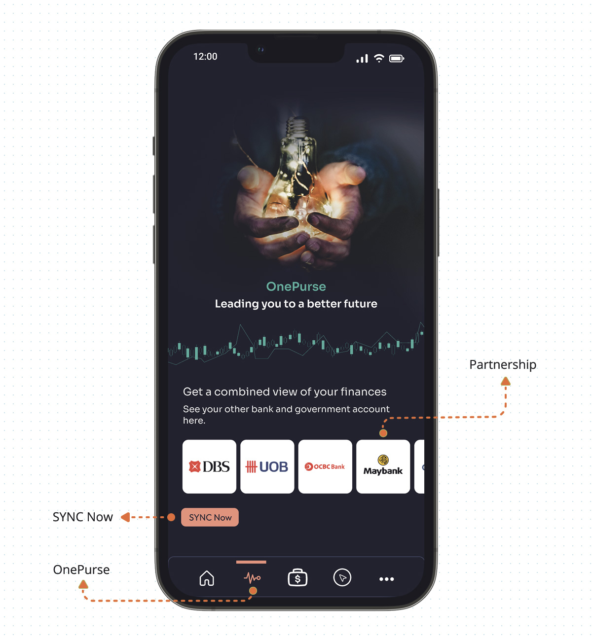
Invest
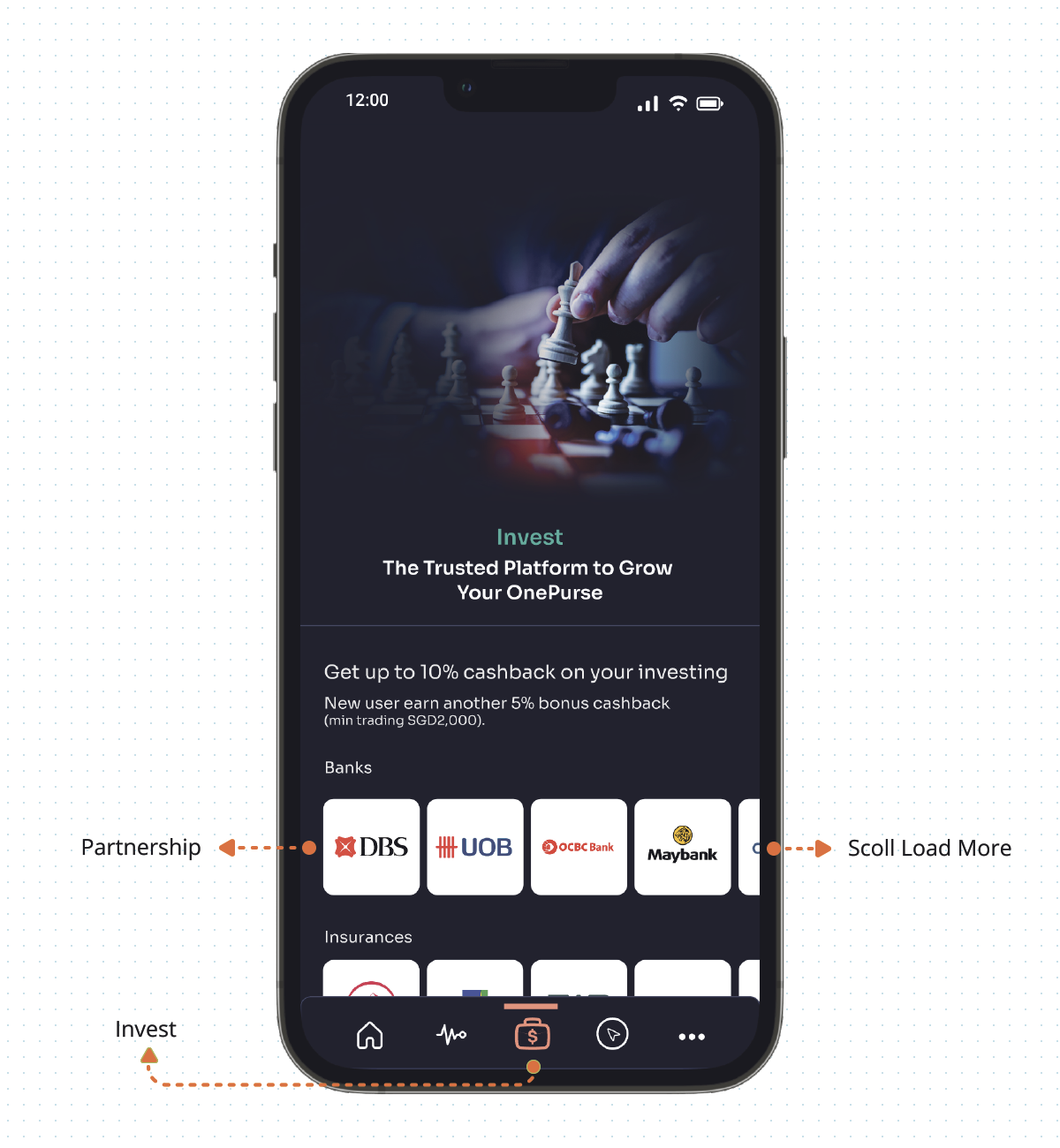
Advisor
More
 Testing
Usability Testing
Persuasion, emotion, and trust are critical factors to increased conversion. There are PET tools have been implemented to motivate people to make decisions that lead to conversion. Then, I proceeded to do a usability test with my high-fidelity prototype. I have invited 5 people to test my design solutions. Some valuable feedback was gathered during this session.
Hypothesis
Users can determine and sync the OnePurse using the SGFinDex via Singpass.
What Do We Want To Find Out
- Will the user find any difficulty to use OctoPurse apps?
- Will the user notice the functions of OnePurse?
- Are the details captured sufficient for them to understand the nature of using the apps?
Test Scenario
OctoPurse apps is a new app chock full of useful features, such as the ability to retrieve account data via SGFinDex with their Singpass login, able to sync all the financial accounts, and a one-stop app to unite their finances. Consolidates them to give you a view of your assets and liabilities, helping you plan more effortlessly. Please show me how you would do it.
Conclusions
All 5 users had no issues navigating through the flow and completing the task has been provided. I noted down the potential areas that need to be improved and from there I make some changes to the prototype.
How to get started
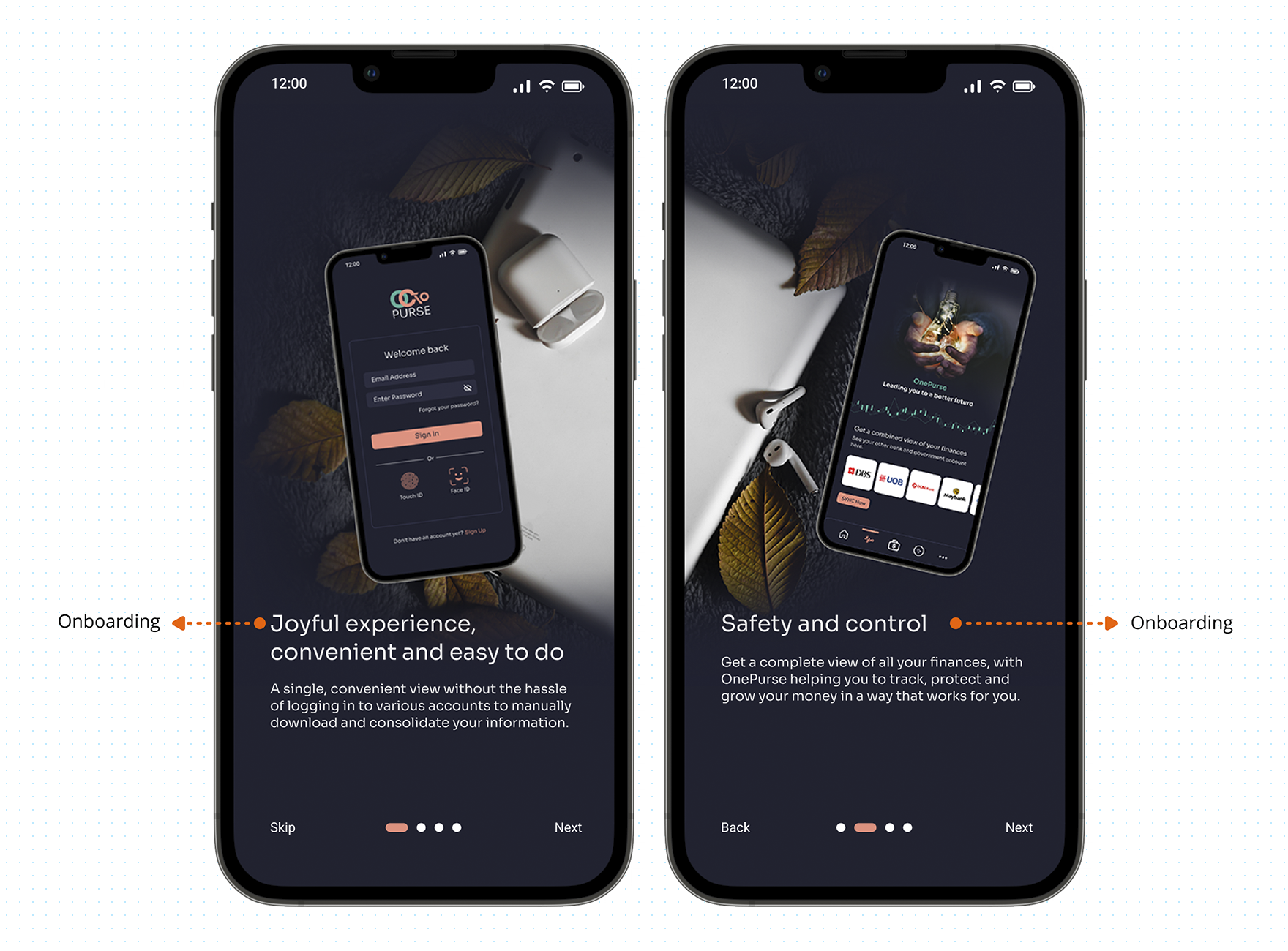
Challenge 1: A user who is not familiar with the apps may need more time or have an issue figuring out how to sync the OnePurse using the SGFinDex via Singpass.
Solution: To avoid users getting confused, provide onboarding before users login.
Home
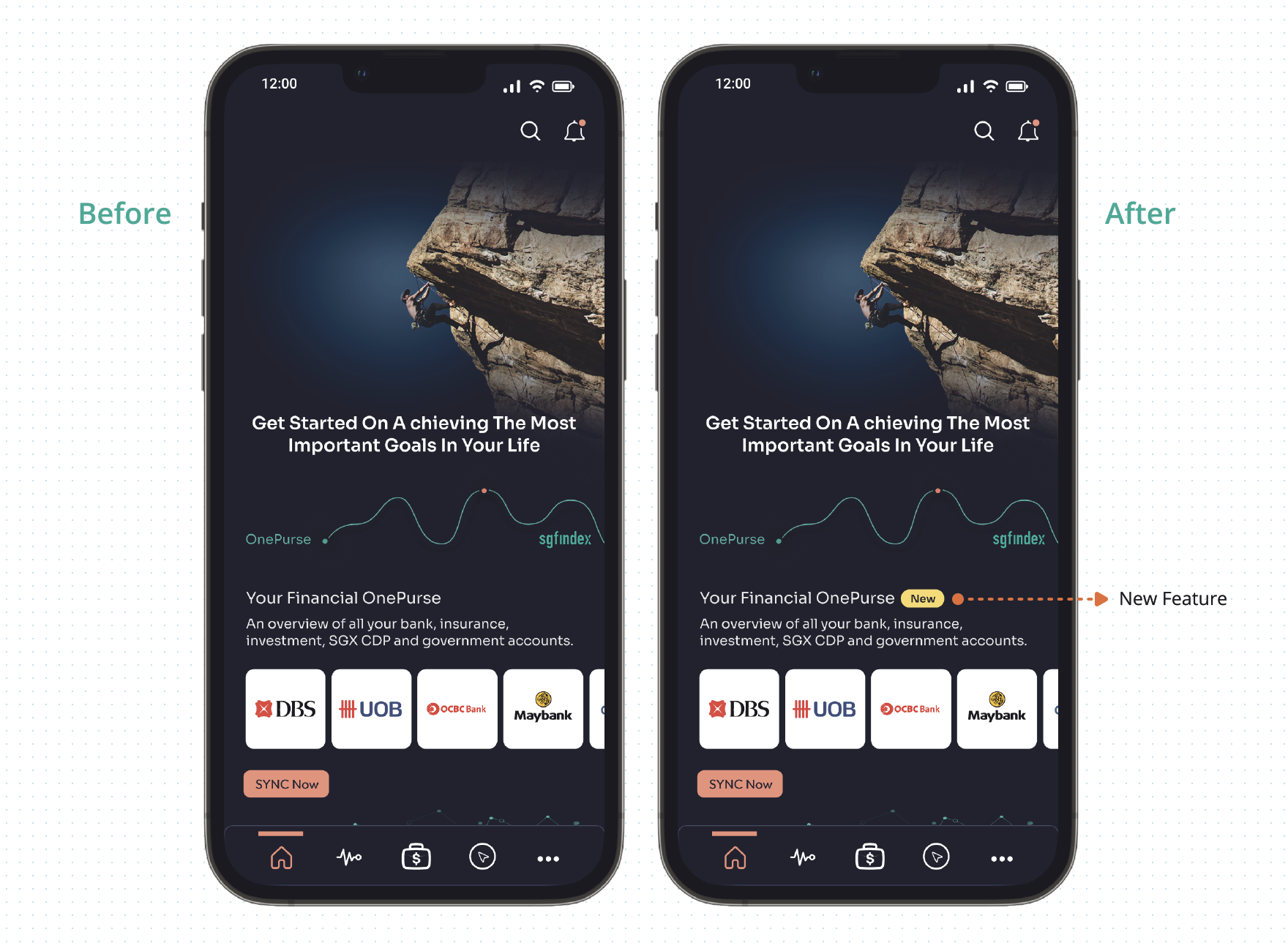
Challenge 2: Users are easily missing out on the new features.
Solution: Add a 'New' label to remind the user of the new feature, this will increase the chance of leading the user to notice the feature.
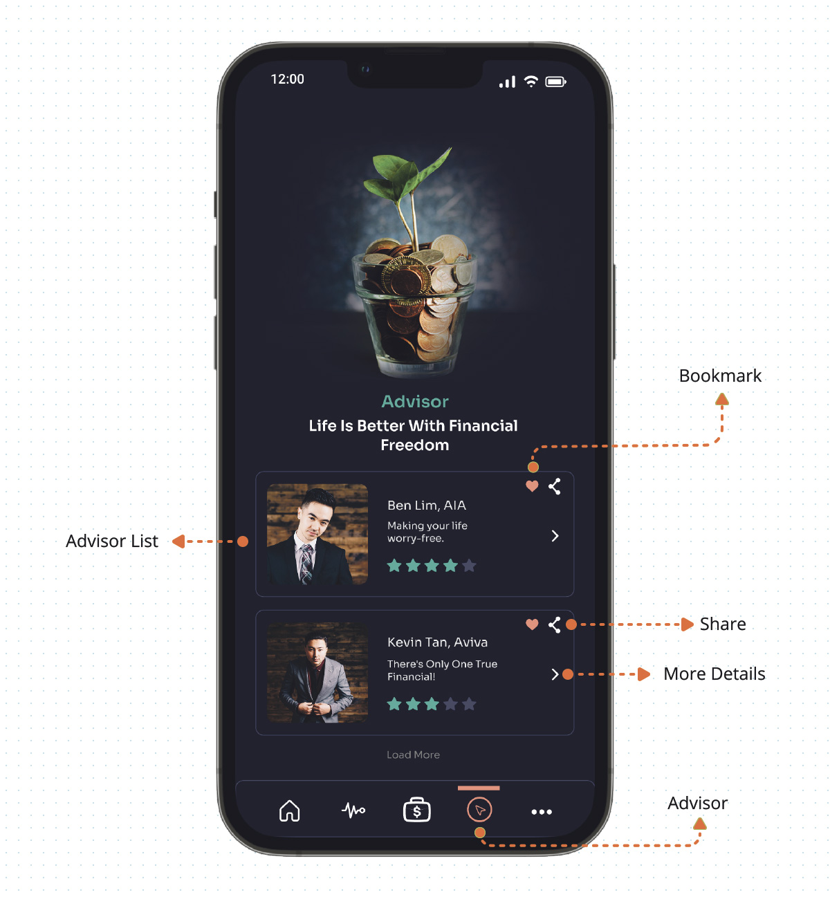
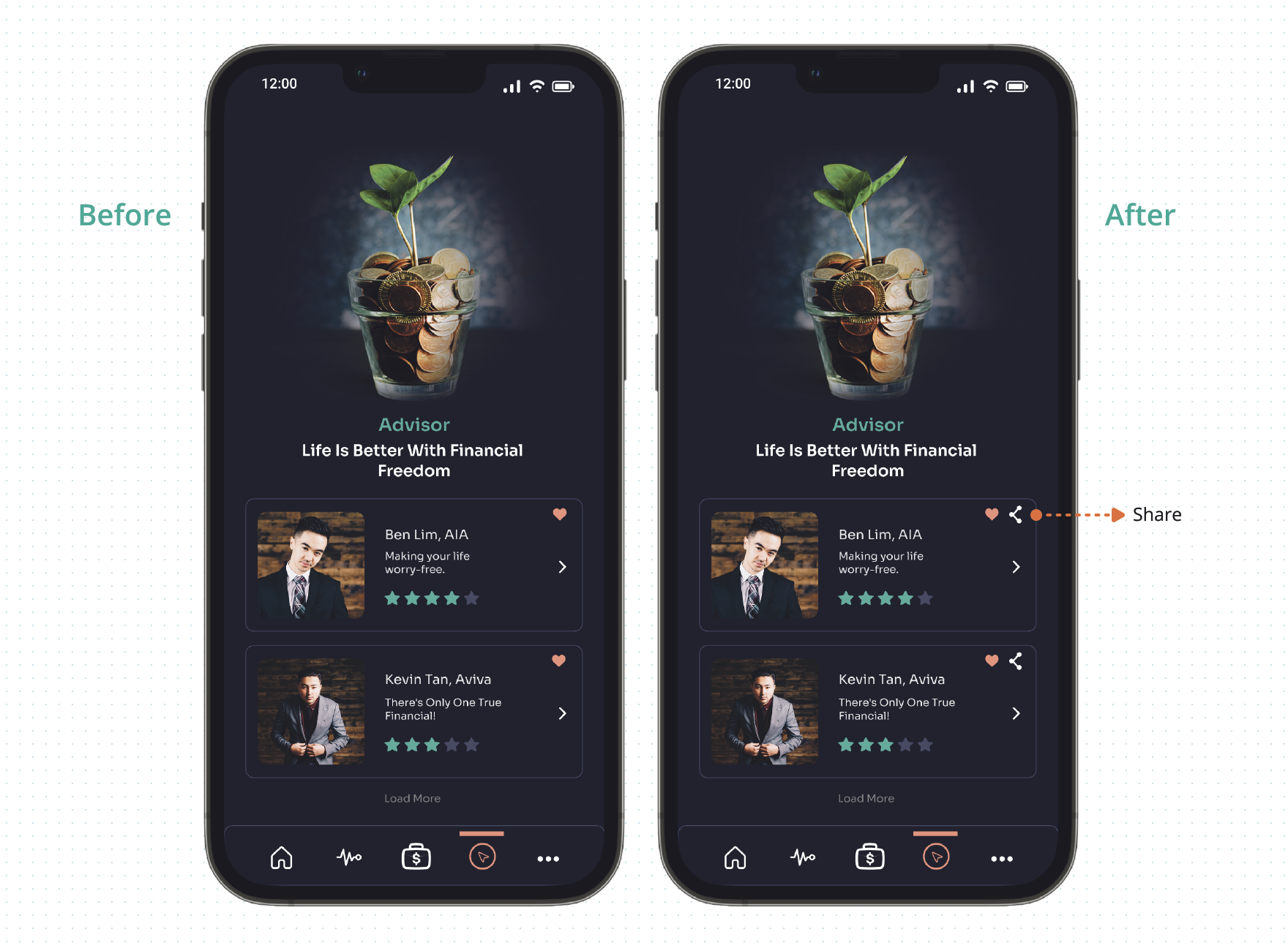
Advisor
Challenge 3: Users feel when using the apps not easy to share and introduce good advisor information with friends.
Solution: Users can share the advisor. A high chance to lead them to recommend the advisor to their friends and family can increase the number of sign-ups, platform usage, and traffic.
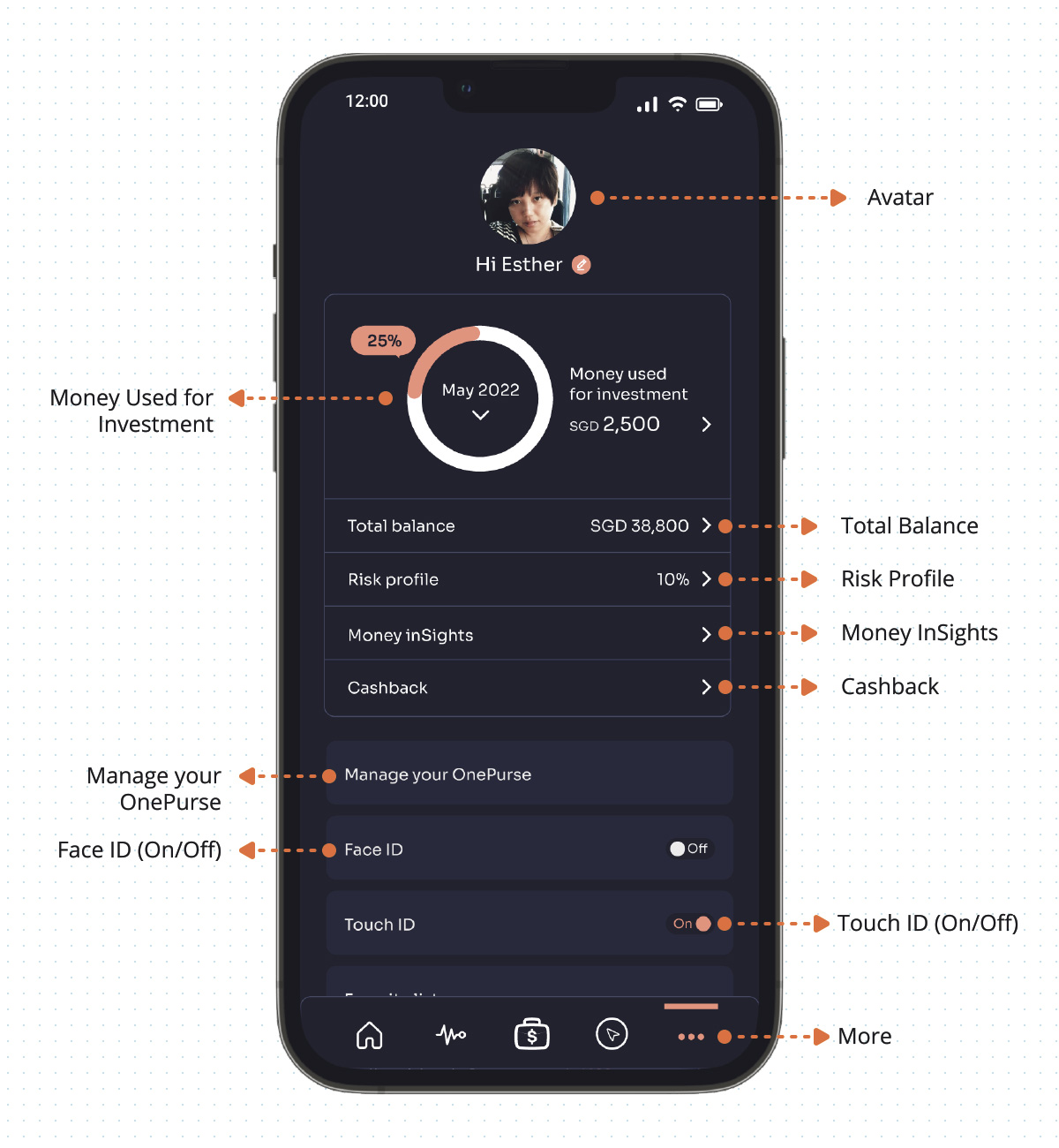
More
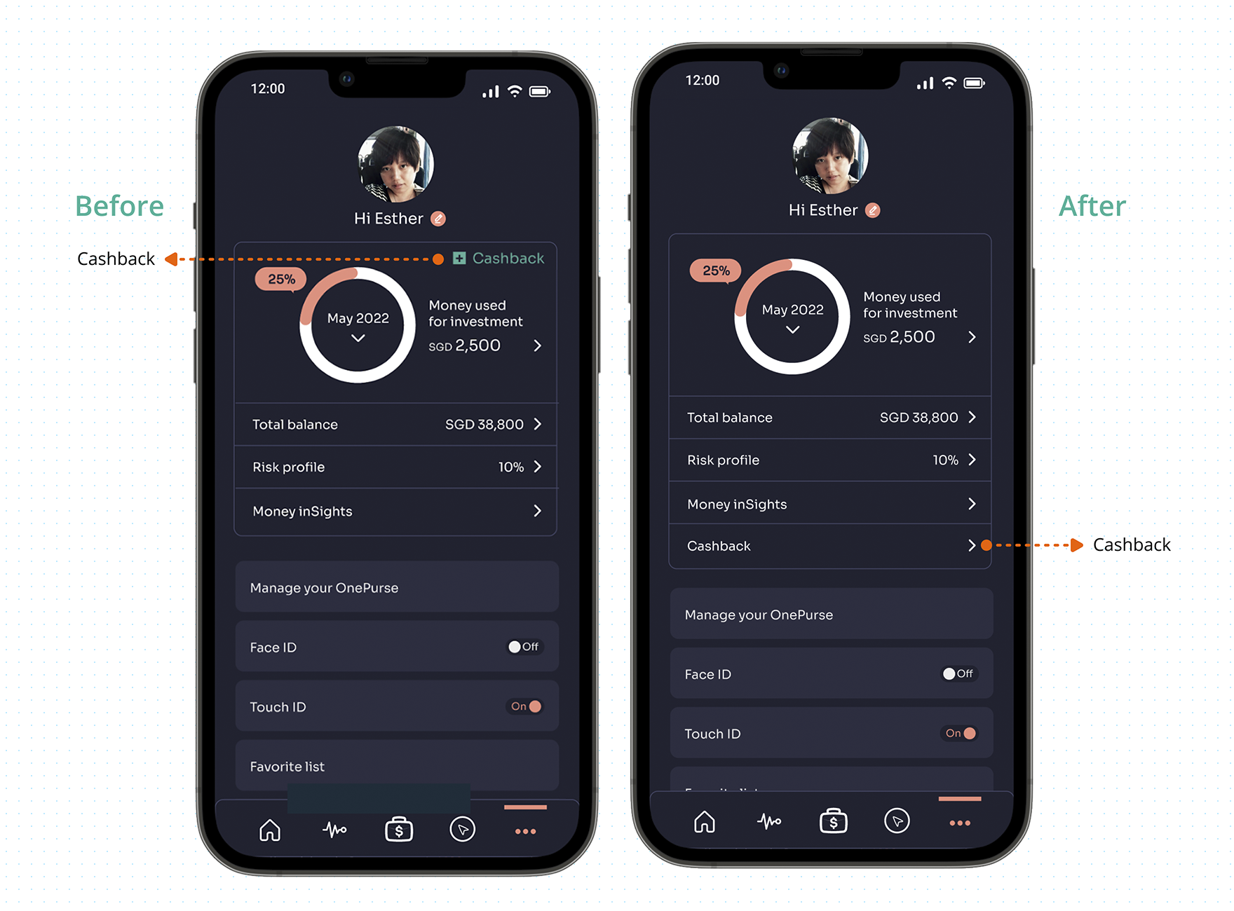
Challenge 4: The Cashback button is small and not obvious, the user may easily miss out.
Solution: Shift down and make the Cashback button more bigger and obvious, so users won't easily miss out.
Future Enhancement
Providing in-app tutorials will increase the chance of leading the user to click on the feature.
Chatbot / Virtual Assistant available 365 days a year and can answer a question 24/7, can speed up customer resolutions. In addition, chatbots can help the business to increase satisfaction with customer service by gaining insights into customer behavior.
Get the latest news on the stock market today updated throughout each trading session, including stock futures, stocks to watch, etc.
Daily Check-in and Gamification – to earn points by checking in the app, check-in consecutively the following days to earn more reward points. Points can be exchanged for a monetary value and applied to a customer's free gift and voucher.
Takeaway
Find Me On